Design Hacks to Take Your Property Website from Mediocre to Marvelous
Is your property website an eyesore? Don’t worry; for today’s marketing tip, I’m sharing five easy ways to give your website a small makeover.

#1—Give Your Font a Facelift
Fonts are an often-overlooked aspect of website design, but they can significantly impact the overall look and feel of your site. Experiment with different font styles to find one that is easy to read and adds personality to your brand. Websites like dafont.com and google.com/fonts offer a wide selection of options. Here are some popular combinations:
- Open Sans and Montserrat: This pairing is great for websites with a modern, minimalist aesthetic.
- Lato and Merriweather: This pairing is ideal for websites that want to balance modern and classic design.
- Roboto and Playfair Display: This pairing is great for websites that want to convey a high-end, luxury aesthetic.
- Poppins and Raleway: This pairing is great for websites that want a balance between modern and classic design elements.
#2—Add Some Color
A vibrant color palette can add personality and flair to your website. Choose a primary color representing your brand and add a bright secondary color to highlight important information. Don’t be afraid to play around with different combinations until you find the perfect match.

#3—Spruce Up Your Images
Stock photography can be a game-changer in making your website look great. Sites like istockphoto.com and unsplash.com offer a vast selection of high-quality images that can bring your property to life. And if you want to take things up a notch, try running your photos through a filter to give them a unique and eye-catching look.
#4—Revamp Your Copy
If your copy is hard to read and, quite frankly, boring, try the following tactics to make it shine:
- Start with a short but bold headline. It can be as simple as saying, “Welcome to Estancia Lofts in LaJolla, CA”
- Create short paragraphs of two to three sentences. This makes your copy very easy to read and digest.
- Create bolded subheadlines.
When a reader scans the page, they’ll first see your headline and then your subheadlines. The subheadlines should describe your apartment community and amenities.
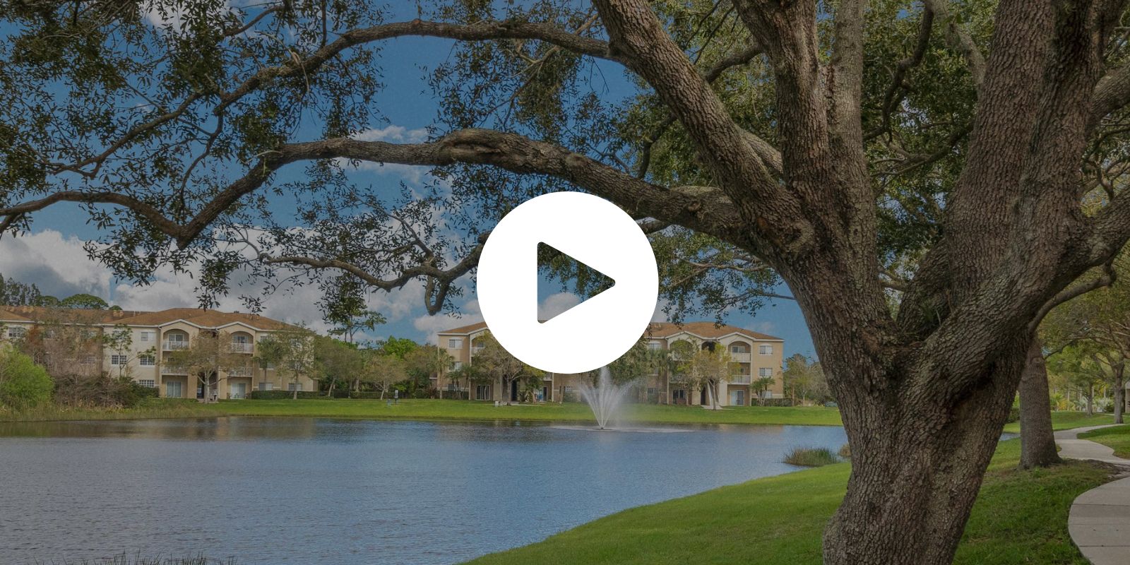
#5—Add a Video Hero Image
A video hero image is a full-width video displayed prominently at the top of a property website’s homepage, often in place of a traditional static hero image. The video typically plays on a loop and is set to autoplay, creating an immersive experience for the prospect as soon as they land on the website.
Video hero images can effectively grab the prospect’s attention and make a strong first impression. Plus, they dramatically change the look of your website. In my opinion, property drone videos look the best as video hero images, but I’ve also seen properties put together 3-4 generic stock videos that represent their brand using istockphoto.com (they have video and photos).
Wrapping Up
If your website is an ugly duckling, it’s time for a makeover. Changing up the fonts, images, and copy doesn’t take much time or effort, but the results can be quite dramatic. And if you find these adjustments aren’t doing your property justice, enlist a professional’s help to develop a website that will truly reflect your brand.

Written by Josh Grillo
Josh Grillo is a #1 Best Selling Author, Speaker and Co-Founder of Resident360.