Print Advertising For Apartments – Dissecting An In-Flight Magazine Apartment Ad
Recently I stumbled upon something you don’t see often, apartment advertising in an in-flight magazine. Check out the full page ad below for Voda Apartments.
What I like about this ad?
- The creative placement in an in-flight magazine. No competition.
- The layout is clean and text is easy to read.
- Clear headline tells you exactly what they are offering, “New Apartments Downtown Kirkland.”
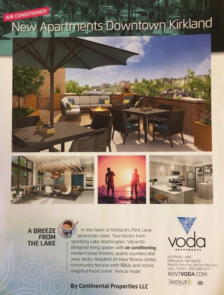
- The photos are good.
- Air conditioning is a big benefit for this area, so they did a good job at highlighting it in pink at the top of the ad.
How could they improve it?
#1. The Overall Design
I imagine the cost of this full page ad is significant, so I’d like to see higher quality design. When comparing it to other ads in the magazine, it blended in, when it needs to stand out.
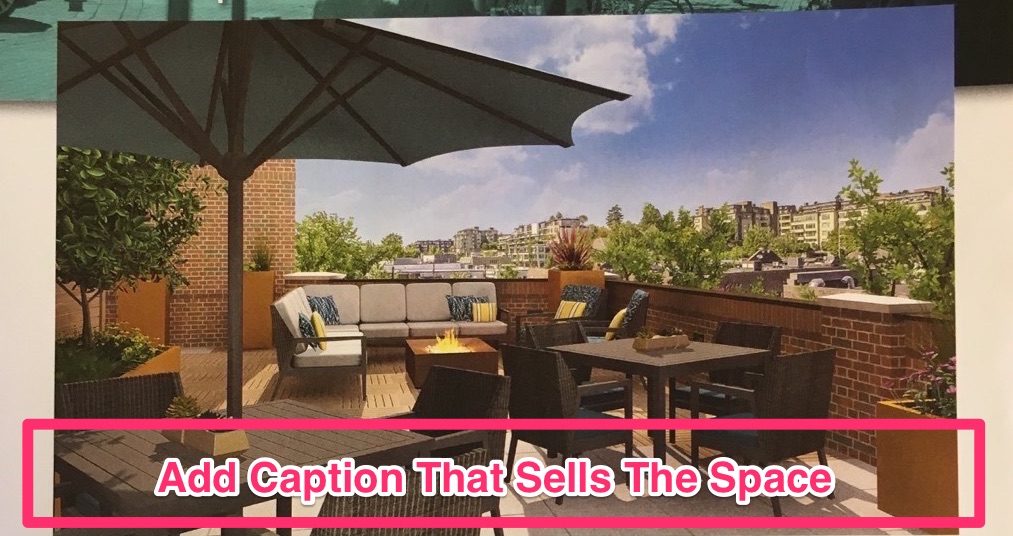
#2. Photos & Captions
While the photos look good, adding a caption to at least the largest one will help sell to the reader what that space is all about.
Pro Tip: Think of captions as a mini-sales message.
#3. Matching Text To Photos
The headline at the bottom left, “A Breeze From The Lake” has a coffee cup rendering beside it, which doesn’t make sense. I would remove it.
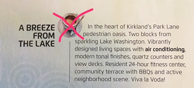
Additionally, I found myself asking the question: Am I getting a breeze from the lake or is it walking distance to the lake? A better choice of words could be: 5 Minute Walk To The Lake.
#4. Professional Copywriting
The text under the photos has very choppy sentences. For example, “In the heart of Kirkland’s Park Lane pedestrian oasis.” That’s the whole sentence. I would recommend having a high level copywriter rewrite this entire paragraph so that is has more flow. Additionally, adding a clickbait style headline above it vs. beside it will give the copy a better chance at being read.

#5. Call To Action
The ad does clearly state the contact information, phone and website on the bottom right side. I would prefer to see a stronger call to action. Using language like, “Check Availability” or “Be First In Line” would work.
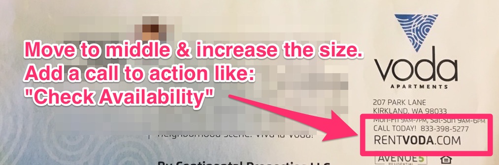
#6. Ways To Respond
Underneath that text I would have the phone number and website bolded and centered on the bottom of the ad so you can’t miss it. Last, the phone number and website url should be unique to this ad for measuring it’s success.
Conclusion
If you’re doing any type of print advertising for your property and want to ensure results, keep the following guidelines in mind:
- There will always be an offer
- There will be a reason to respond right now
- There will be clear instructions on how to respond
- There will be tracking and measurement
- Whatever brand building occurs will be a happy by-product, not bought
- There will be follow up
- There will be strong sales copy, not vague hyperbole
- In general, it will look like “Mail Order Advertising”
Additionally, if you would like to dive deeper into print advertising techniques and tips, here’s a fantastic short video worth watching.
Like This Post?
Please take a second and share on your favorite social media.

Written by Josh Grillo
Josh Grillo is a #1 Best Selling Author, Speaker and Co-Founder of Resident360.
Leave a Reply
You must be logged in to post a comment.