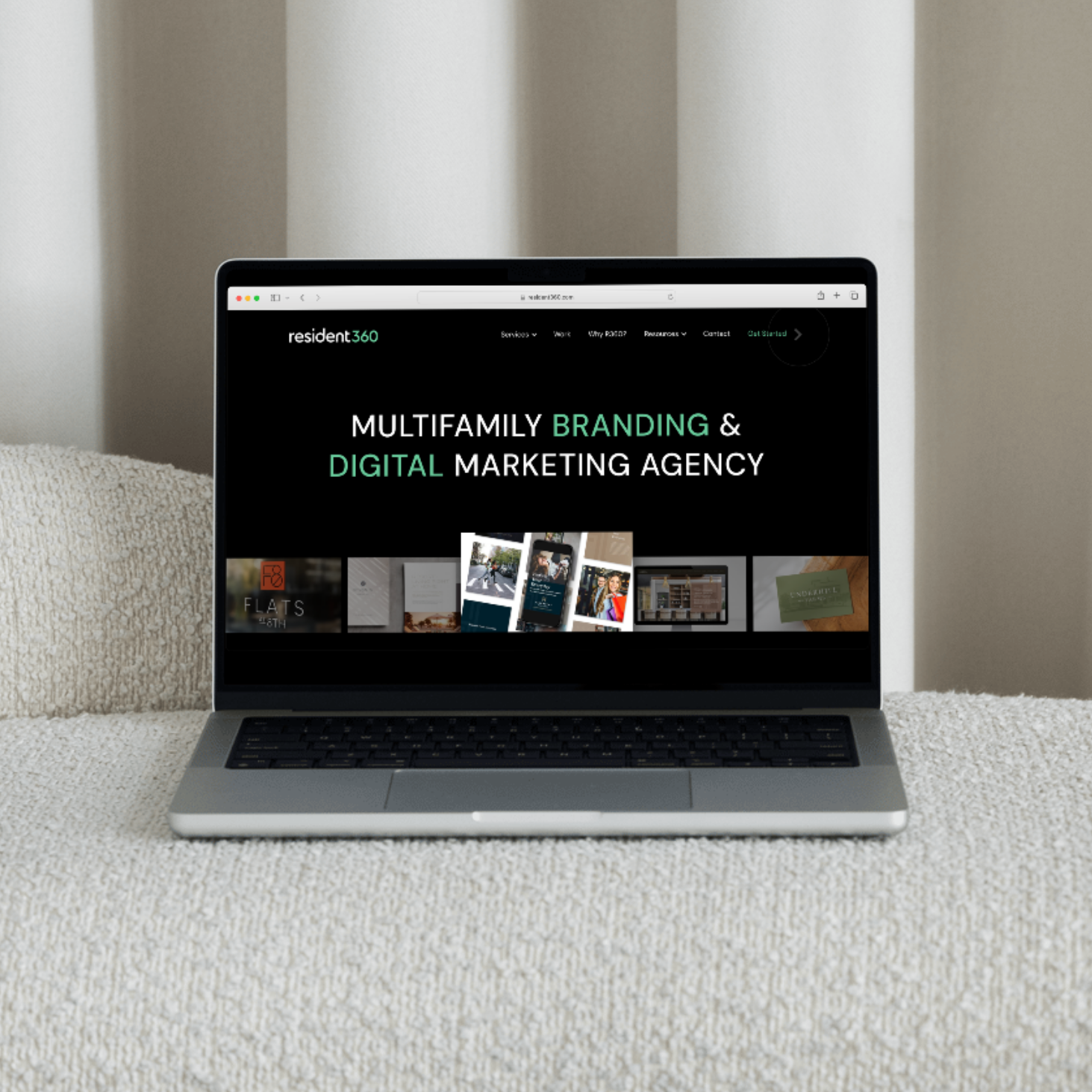
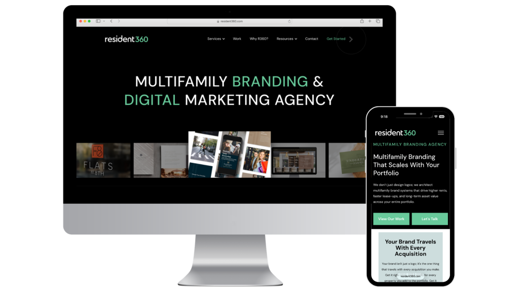
Overview: Most companies delay a multifamily website redesign because the old site is still generating traffic. But a corporate website that works and one that accurately represents the company are two different things, and the gap between them tends to widen quietly. Resident360 Creative Director Michael Hinde reflects on what years of planning a full redesign revealed about brand presentation, design, and the question every multifamily company should be honestly asking about their own site.
Creative Director Michael Hinde on What a Redesign Really Takes
At some point, almost every company’s corporate website becomes a time capsule. Not of what the company does — of what the company used to be. The team has grown, the services have expanded, the work has gotten better. But the site still looks like it was built for an earlier version of you.
Most companies know this. They just have other things to do.
Resident360 recently launched a full redesign of our own corporate agency website — one that had been years in the making, deliberately and by circumstance. This is what we learned along the way, and why it matters for any multifamily company that’s been having a version of the same conversation.
The “It’s Working” Trap
There’s a version of this conversation happening inside almost every company with an aging website: we should redesign eventually, but the site is still generating leads, and we don’t want to disrupt what’s working.
It’s a reasonable position. It’s also how companies end up years behind without meaning to.
For a while, that was the honest calculus at Resident360. The old site was functional. Business was coming through it. So a full redesign stayed on the list — talked about, roughed out in early conversations, deprioritized whenever client work (always) came first.
“The site was working,” says Michael Hinde, our Creative Director. “We were getting leads and business through it, so we didn’t want to upset that.”
The problem is that “working” is a very low bar for your most visible marketing asset. A site can generate leads and still misrepresent what you actually offer. It can be functional and still be the least accurate version of you online.
As Resident360’s services expanded and the work became more sophisticated, the site didn’t keep pace. The gap between what we could do and what the corporate website design communicated widened quietly. That kind of gap is harder to see than a traffic dip — it shows up in first impressions that don’t match the reality on the other side.
We took this question further on the Multifamily Marketers Podcast — listen to Ep. 58: Is Your Corporate Website Helping or Hurting Your Leasing? to get the scoop.
“Outdated” Is the Wrong Word
When most people say a website is outdated, they mean it looks old. New photos would help. The typography feels dated. Maybe the colors need a refresh.
That’s not really what a creative director means.
“As an experience, the site was pretty boring,” Hinde says. “Not just because it lacked animation or newer images, but in the structure and layout. There was a lot of image-left, copy-right, then image-right, copy-left. It was repetitive, with lots of copy that wasn’t presented in a way that would keep people interested and scrolling.”
A site can have beautiful photography and still be boring at the structural level. The layout had become a template — a predictable visual rhythm that communicated nothing about the thinking behind it.
“Over time, the old site started to feel templated and cobbled together rather than thoughtful and well-designed,” he says. “You want it to feel like the content was considered when it was designed.”
This applies to apartment websites just as much as agency sites. A community can have professional photography and a clean layout and still fail to communicate why this is the right place to live. Boring structure is invisible until it costs you a lease.
The Question Worth Asking Honestly
The shift from nice-to-have to necessary usually isn’t a single event. It’s a slow accumulation — until someone asks the uncomfortable question out loud.
For Resident360, that question was this: if it came down to just the website, who would you hire?
“Our competitors looked better on the surface,” Hinde says. “They seemed more experienced, even more capable — even if underneath we could offer better services and expertise. So we asked ourselves: if it came down to just the website, who would we hire? If the answer wasn’t R360, it was time for a change.”
Strip out everything internal — the team knowledge, the track record, the client relationships — and ask what a stranger sees when they land on your site for the first time. That’s the real question, because most prospects are strangers. They don’t have the context. They have the website.
It’s worth asking the same thing about your own property or company. If a prospective resident or client could only see your website — no referrals, no reputation, no word of mouth — would they choose you?
What Good Design Actually Does
For the redesign, the team looked well beyond multifamily for structural inspiration: brand agencies, retail sites, other marketing platforms that had figured out how to make a lot of content feel navigable rather than overwhelming.
“Some agencies are very visual and don’t need much content on their site, but we have a lot of different services, and we rely on our website to generate leads, so that content is really important,” Hinde says. “It also has to be SEO-friendly so we stay at the top of search results and top of mind in the industry.”
One of the more honest things Hinde says about the finished site is that the best parts are the ones nobody will notice.
“It’s the way everything is considered and carefully laid out. It really shouldn’t be something people notice, because it’s the kind of thing you only notice when it’s missing. You notice when it’s wrong, not so much when it’s right. When it’s right, it should just feel natural.”
That’s the actual return on a well-designed corporate website: not compliments, but the absence of doubt. No friction. No moment where something feels slightly off and the visitor can’t say why. That absence accumulates into trust, and trust is what converts.
Once your site tells the right story, the next step is making sure it converts. See how to align your multifamily website CTAs with every phase of your lease-up in our blog: How to Optimize Your Multifamily Website Call-to-Actions for Every Lease-Up Phase.
Getting It Across the Finish Line
One thing that rarely gets discussed in redesign conversations is how hard it is to actually complete an internal project. Client work always comes first — that’s not a policy at Resident360, it’s a value — which means internal projects get shelved regularly and without apology. There’s also the problem of proximity. Designing something for yourself puts you closer to it than any client project, and that closeness is both an asset and a liability.
“I had to let go of some things I had gotten excited about,” Hinde says. “Things that would really scratch that designer itch, but ultimately weren’t right for the site or the agency.”
Getting a redesign across the finish line requires knowing when to stop refining and ship. The best version of something that never launches is still a website that no longer represents you.
Most companies with an aging corporate website design aren’t ignoring the problem; they’re managing it against everything else. The site keeps working in a functional sense, and functional feels like enough until it doesn’t.
The thing is, your corporate website is doing its job every hour of every day, with everyone who hasn’t already decided to trust you. It’s showing up on your behalf whether or not it’s ready. The question isn’t whether to update it eventually. It’s whether the version of you that’s showing up right now is the version worth showing.
If the answer to “if it came down to just the website, who would you hire?” gives you pause — that pause is useful information. We’d be glad to help you figure out what to do with it.